Mobile-first booking
Your link gets opened on a phone. Build for that.
Booking links live in texts, QR scans, and group chats — small screens, one thumb, thirty seconds of attention. Our public pages are designed at phone width first, with the Book button pinned where the thumb already is.
Included on the free plan. No credit card.
Desktop-first booking pages punish phone visitors.
Shrink a desktop booking page onto a phone and you get 8px tap targets, a calendar that needs pinch-zoom, and a Book button that scrolled away three screens ago. The visitor came ready to book and left because the page made their thumb work for it.
That tax lands on exactly the wrong traffic — the parent in the car line, the prospect who scanned your QR at the booth. The closest they will ever be to booking is the moment the page loads.
How it works
- 1
Designed at 390×844 first
Cards and schedules are laid out for a phone screen, then widened for desktop — not squeezed the other way.
- 2
Tap targets, not click targets
Every bookable row, chip, and button is at least 44px tall. Thumbs miss less, bookings finish more.
- 3
The Book bar follows the scroll
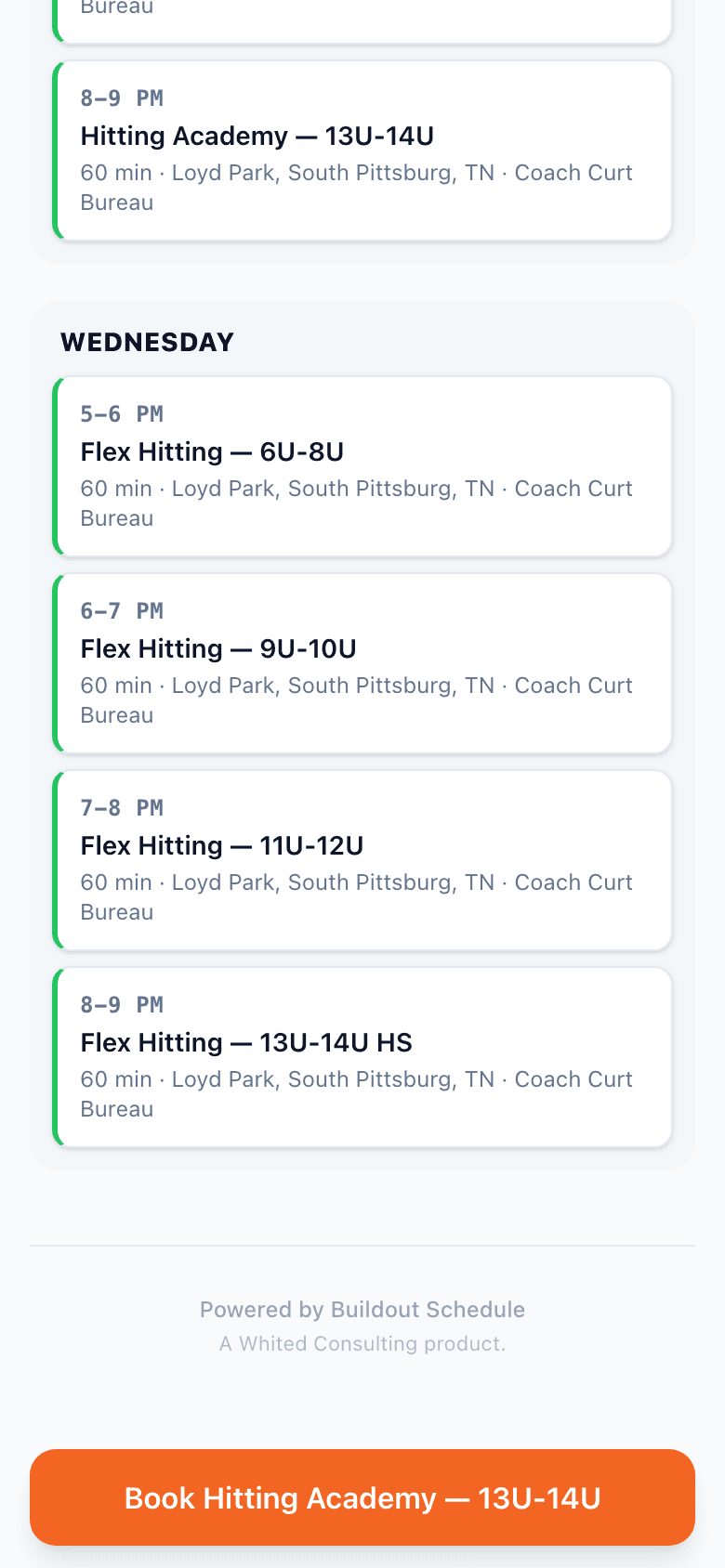
The sticky bottom bar keeps the booking CTA in thumb reach and updates to the session being viewed.
- 4
Booking stays on the page
The flow opens as a bottom sheet — day, time, confirm — with no redirect for a mobile browser to fumble.
Build yours in 5 minutes.
Pick a template, swap in your details, publish. Free plan, no credit card.
Goes well with
Common questions
What does mobile-first mean here, concretely?
Pages are designed at 390×844 and widened for desktop, not the reverse. Every bookable element is a 44px-plus tap target, the booking flow opens as a bottom sheet, and the primary CTA stays a thumb-reach away in a sticky bar.
What's the sticky Book bar?
As a visitor scrolls a card or schedule, a bar pins to the bottom with the booking CTA for the session they scrolled to. When the page convinced them, the button is already under their thumb. Owners can turn it off per page.
Does booking open a new tab?
No. The picker slides up as a sheet on the same page — day, time, details, confirm. Mobile browsers lose people on redirects; we keep them where they are.
Can visitors add it to their home screen?
Yes — public pages are standard responsive web, so save-to-home-screen works from the browser share menu. No app install for you or them.
Does the vCard work on both platforms?
Yes. iPhone and Android both open the native Add to Contacts prompt when a visitor taps Save contact on a Rep Card.