Blog · How-to guides
The 3 buttons every service business needs on a mobile booking page
A book button above the fold, a save-my-contact button, and a tap-to-call strip. Why each one earns its spot on a phone screen — and what to cut to make room.
Chase Whited · July 16, 2026 · 4 min read
Your booking page gets opened from a text thread, an Instagram bio, or a QR code on a flyer. All three are phone moments. The visitor is standing in a parking lot or lying on the couch, holding the page one-handed, and they will give it one screen's worth of attention before deciding.
Most booking pages are built on a laptop and reviewed on a laptop, so they fail that test. Desktop gives you room to be vague — a phone screen makes you choose. Three buttons deserve the space. Here's the case for each, and the case for cutting almost everything else.
Button 1: the book button, above the fold
Above the fold on a phone means the first screen, before any scroll. That's roughly one headline, one face, one line of text, and one button. The book button has to be in that set.
The argument is arithmetic. Every scroll between the visitor and the button costs you a percentage of them — not because people can't scroll, but because each swipe is a fresh chance for the text they were reading, the kid in the back seat, or a notification to win instead. The person who opened your page already decided to look at times. The page's only job is to not get in the way of that decision.
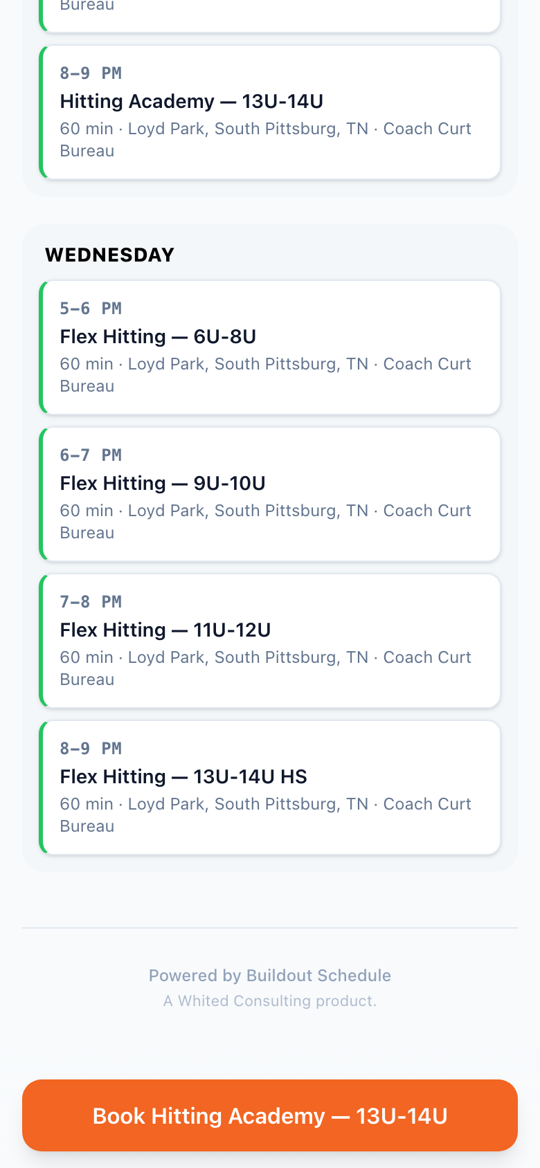
Thumb reach settles the placement question. One-handed, the easy zone is the bottom half of the screen; the top corners are a stretch. Put the button low and full-width, or repeat it — once up top, once floating within thumb reach as the page scrolls. Label it like a decision, not paperwork: "Book a time" beats "Submit."
Button 2: save my contact
Not everyone books now, and the ones who don't are not lost — unless you make them retype who you are. The save-my-contact button downloads a vCard: your name, number, email, and booking link land in their phone's contacts app in one tap.
Why it earns a permanent spot: it converts "not now" into "findable later." The homeowner who scanned your QR at a home show doesn't need a contractor today. Three weeks later the water heater dies, and they search their contacts — not their memory, not a stack of business cards, not a search engine full of your competitors. You're already in the phone, with the booking link attached.
A paper card does the same job until it goes through the wash. The vCard is the card that files itself, and it's one tap instead of "let me type that in while we're both standing here."
Button 3: the tap-to-call and tap-to-text strip
Some jobs are a question before they're a booking. "Do you handle water damage?" "Can you take a 4-year-old?" A page that only offers a calendar tells that visitor to go away and come back certain — most won't come back at all.
The contact strip fixes it with the phone's own muscle memory: a phone number and a text option that start the call or the message in one tap. Nobody should read a number off your page and type it into their dialer — that's four steps and two apps for something the phone does in one. The strip also respects how different customers buy. Plenty of people, especially for trades and health services, will always want a voice before a booking. Give them the tap, take the call, and send your booking link in the follow-up text.
What to cut
The three buttons earn their space by doing a job. Most of what fills a typical mobile page doesn't, so cut it:
- The navigation menu. This is a landing page, not a website. Every menu item is an exit.
- The mission paragraph. Nobody books because of a philosophy. One line about who you help is enough — the writing guide for booking pages covers what that line should say.
- The photo carousel. One good face beats six swipeable stock images. Faces build trust; carousels build load time.
- Anything that autoplays. The visitor is possibly in public. Sound is a punishment.
What stays besides the buttons: your face, one line of intro, and one piece of proof — a testimonial or a number. Proof supports the buttons. Everything else competes with them.
The page that already works this way
This three-button layout is exactly what a Rep Card is: a mobile page built around your booking link, with the book button, the save-my-contact vCard, and a tap-to-call contact block as first-class pieces — plus the QR code and share sheet to get it into phones in the first place. The whole thing is designed mobile-first, because that's where it gets opened.
For a solo operator or a small crew, this page usually replaces the "website" entirely for booking purposes — the longer case for that is on the small businesses page.
Either way, run the test that matters. Open your own booking page on your phone, one hand, standing up. Count the taps to book a time, save your contact, and start a call. If any of the three takes more than one tap from the first screen, you've found this week's fix.
Keep reading
- How to share your booking link in person without typing it
QR codes on the things you already print, the share sheet mid-conversation, and a vCard that saves you into their phone as a name. The plays that book the person standing in front of you.
- How to set up buffers and minimum notice without losing bookings
When a buffer should be 0, 10, or 30 minutes, how minimum notice trades same-day bookings for prep time, and the over-protected calendar that quietly shows nothing as available.
- How to write a booking page that converts
The copy on a booking page does more work than the calendar. What to say in the title, the description, and the button — with the rewrites that turn lookers into booked meetings.